Data on Income and Wealth
Data on Income and Wealth
The data used in all analyzes is presented in two spreadsheets available for download. The sources of this data is one government report or another: IRS, Census Bureau, Bureau of Labor Statistics, even the CBO.
Time line trends of income are generally computer using a form of the CPI, consumer price index. There are some serious limitations in this analyses. Also the general lack of inclusion of taxes paid and welfare received do not reflect well on the actual differences between quintiles of income.
CPI and the Gini Coefficient are defined and analyzed for use in our investigation into income distribution, in order to be sure that the conclusions drawn are valid. CPI has some limitations in the manner in which many use it to analyze time trends in income.
It is clear that the standard approach is not sufficient, and therefore in the next Chapter we will be exploring modifications to the popular idea that the "rich are getting richer at the expense of the poor."
We do see two distinct periods: a flat period
up to the 60's and
then a growth in income distribution since.
then a growth in income distribution since.
Outline
Chapter 1: Data Sources and Validity
Chapter 2: Income Distribution in Depth
Chapter 3: Define Terms like Poor
Chapter 4: Income mobility
Chapter 5: Critical forces acting on us
Chapter 6: The Occupy Movement
Chapter 7: Buffet Rule fair?
Chapter 8: Conclusions
The Data and its sources, where is it from?
The sources of the base data on income is from the IRS, Census Bureau, some from the Bureau of Labor Statistics, and even Forbes (for the richest 400). The spreadsheets from Saez, et all have been used in many articles which generally promote the inequality is a growing theme.
The data from each source has been collected into some spreadsheets which are available from this webpage Here.
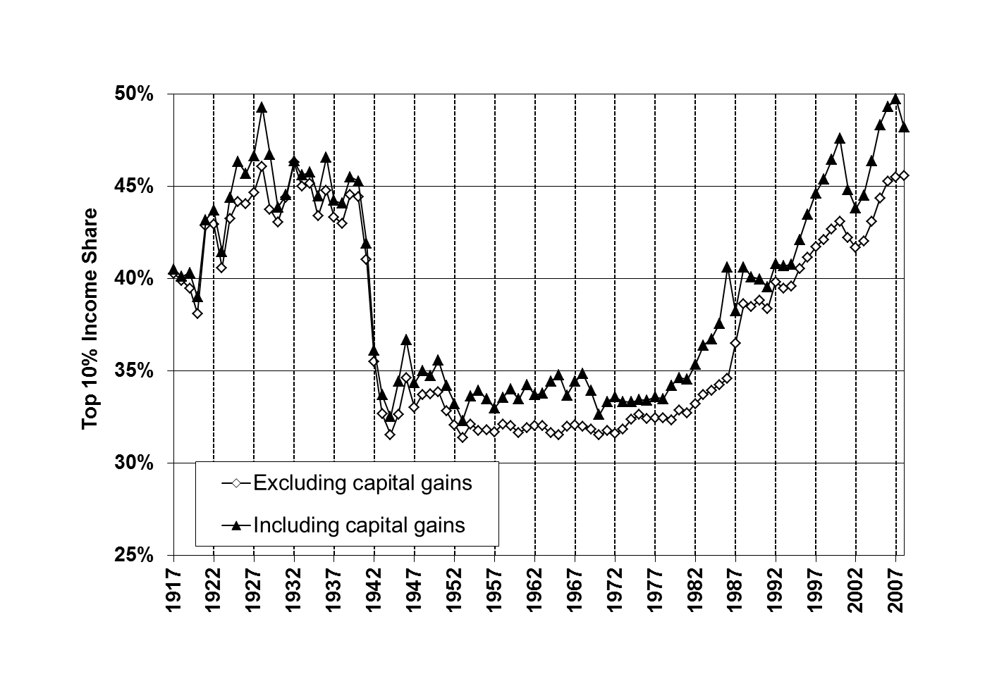
Each data source has its limitations. In the case of the IRS data, reported income is critically dependent on the Tax code at that time. Saez puts forth the oft referenced curve shown at right as indicative of a growing inequality in income distribution. It has been used extensively as proof of a growing inequality in income, but rarely are questions asked as to its validity and the causes of this growth. Also this data shown in the graph at right does not include transfer payments.
The top 10% of income makers experienced over a time period from the early '40s to the early '80s of relatively flat income distribution. From that time of the late '70s, the income share (percentage of the total national reported income) crept up for a variety of reasons, which we will delve into in coming chapters. We do however have 2 distinctly different periods having different forces operating.
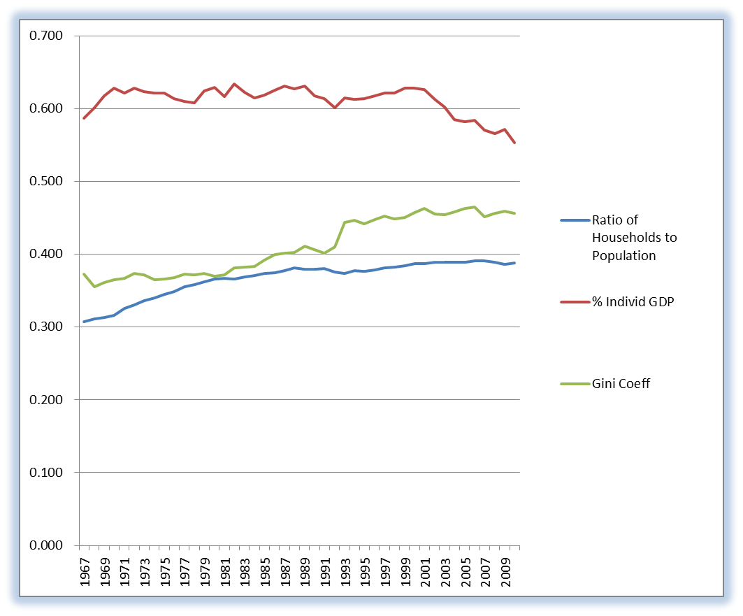
First of all we should point out that this is the top 10% of tax units, essentially tax filers. This relates to the population and households in the graph shown nearby. The ratio of households to the total population (is nearly the same as Tax units) is not a fixed number over this time period, nor is the number of people in a household the same for all income levels. The number of households from 1967 to 2010 rose over 3X.
What we do see is that at the high end of income earners, the percentage of income reported was larger in percent of total. The Gini coefficient rose gradually during this entire time period, from 1967. This time period is the focus of our study here.
The history of the tax code is also pertinent here, as the taxes on some forms of income changed dramatically in the '80s to wit it was more advantageous to declare income than to have other forms not tied to tax unit declaration.
So the data waters are getting a little murky as we proceed deeper into the details. So in closer examination of the data we can, in the next section consider the notion of how well did the populace do in bettering their lives. For if the rich did became richer, at the same time a good deal of the public were also much better off then we can raise another question. There are some pieces of this puzzle to consider before we can answer that question.
Historical Trends: how computed
The historic trends are often in the form of either percent share or inflation adjusted dollars. The percent share is simply the ratio of different groups to each other or to the total. The adjustment for inflation is usually stated in something like 2010 dollars. The manner in which the data is corrected for inflation is to use a form of CPI to correct previous years to the current year. Since one parameter CPI is used for all consumption, there is an inherent limitation (see below).
The trend data is rarely shown with taxes and transfer payments included. None of the data above shows the effect on income after taxes and welfare. The effects of both will be considered below in the discussion on Gini coefficient and in the next Chapter.
There has been a preference to show median data rather than mean data for the express reason that one large value can raise the mean. However since the number of households in each category is large, using the mean can provide a better idea of the total average income in each quintile. The data for each type will be compared in the next Chapter for completeness.
Clearly the ratio of different quintiles using the mean value is not often done, but offers a means to better understand the progression of income increase over time. This will be one of the data set comparisons presented in the next Chapter.
CPI and all of its limitations
The Consumer Price Index has seem changes over time in how it is computer, and what its definition is. See this Link for the definition of the various CPI's used for different reasons. The history of the various definitions and how the data is collected is also a factor in the quality of the values of CPI, and how it can be used. For one distinction, CPI is gathered for the urban population only.
The inherent limitation in its use for long-term trends is that tries to collage all variability over the quintiles into a single parameter. CPI is useful in showing the inflation trends in recent years. But to describe how the lower quintile makes consumption decisions over time is not well represented with the CPI approach.
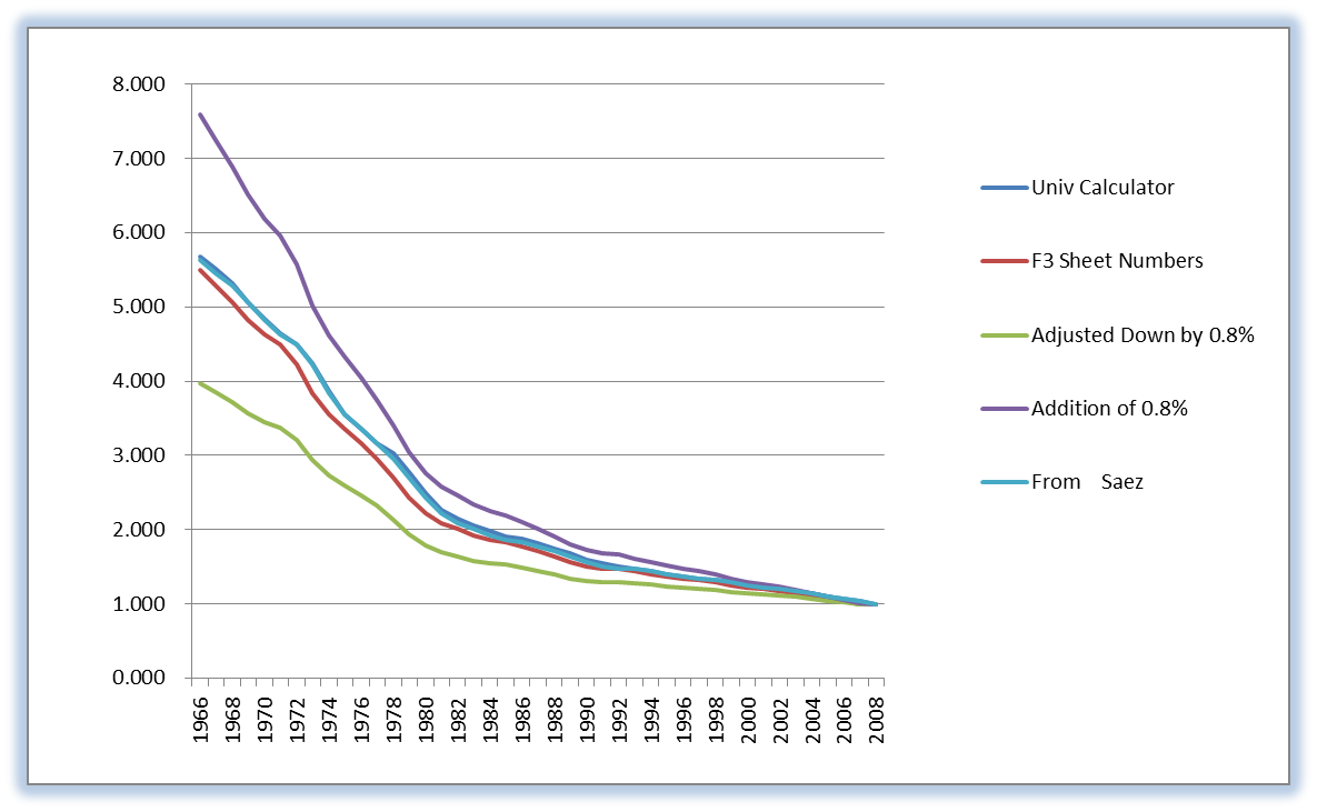
One attempt to correct for differences in consumption between the lowest quintile and the others is shown at right and is based upon the adjustment of 0.8 percentage points lower inflation for the poor. This correction for CPI is well argued by Sullivan and Meyer and by Cato. This graph also shows how close all of the standard CPI curves are over time: University Calculator, Worksheet numbers, Saez data. One can also make a heuristic argument that the inflation rate for the rich would be higher over this time period. The inflation adjustment of 0.8 percent higher is also presented in this graph. These curves will be used to generate a What-If analysis on the income distribution in a later Chapter.
The data analysis shows that the simple CPI will grossly overestimate both the number that are poor historically and presently, and that the consumption equality is more apparent when seeing the actual consumption habits over time.
The cost of food for instance has fallen from 17% of GDP in the 60's to under 5% of GDP today, on average. While no doubt the difference between the expenditures of the rich and poor in this category have diverged substantially. Take any consumable today and divide the current price by 6 (see graph above) and ask the question is that result less than what I paid back in the 60's? In some cases the answer is yes and in other cases the answer is no. How your well-being improved is therefore the question. Clearly in housing and energy the corrected cost is still higher than what was available then. In many cases we are better off today, such as in food. All of the segments of the economy that have seen the most truly free market are more than likely cheaper now in real dollars than back then.
Gini Coefficient: a parameter useful for comparison
The Gini coefficient is simply put the ratio of areas under a specific curve. See this link for an in depth definition. Suffice it to say that the larger the Gini value, the more the income distribution is farther from a 45 degree line, which represents completely equal income for all of the population. In such a case the Gini value would be 0. For the case where all of the income is made by a very small portion of the population, the Gini coefficient is close to 1.
In 1993, the Census Bureau began using a new method of collecting income data, allowing respondents to report greater income values in the Current Population Survey. A change that may affect only a small number of cases (particularly those at the upper end of the income distribution) can have a considerable effect on inequality measures, like the Gini coefficient and shares of aggregate income, while making little or no change to median income. This however had a profound effect on the upper end of the income distribution by recording income levels that had been previously underreported. The impact of this change on measured income inequality was quite large, and we are unable to determine precisely the proportion of the increase in income inequality between 1992 and 1993 that is attributable to this change.
The sensitivity to large swings in income distribution over time is however possible. To say that there is an ideal Gini value or that it should remain constant is not an acceptable or plausible approach.
The effects of race and geography are analyzed, with Backs and Hispanics realizing a larger distribution of income and therefore a higher Gini coefficient perhaps by as much as 0.05. Most of the USA is near the average of Gini = 0.46. Countries across the world report their income distribution in presumably disparate ways, but nevertheless the values vary from the low 0.3 range to nearly 0.6 (for China and India).
In the case of having a large value for some period of time, that might indicate a growth spurt in the economy. Even Inequality Advocates have argued that the income distribution is unequal during some significant changes in the economy. The transition from a manufacturing economy to a information and skill based economy is such a transition. A topic to explore in the next Chapter.
Data is data and conclusions are conclusions, and
hopefully there is some solid relationship between them.